I've had several iSTAMP readers e-mail me lately asking how I photograph my artwork. I'm extremely flattered that they think my photographs are good enough to share my process with others. You will probably laugh when you see the unsophisticated methods I use! There are many stampers/bloggers whose photographs I look at with great envy! What I have learned, I've learned from others ... AND everything I do is a result of alot of experimenting! I have tried the photo cubes and other methods, but this process is what works best for me ... EQUIPMENT. I do not own a fancy, expensive camera. I use my Nikon Coolpix 5200 point & shoot digital camera.
WHERE. I take most of my photos at my stamping workstation ... see photo below. I wanted to point out a couple of things in this photo. First, the window with the blinds open. I have found that the more natural light I have coming in the room, without it being direct sunlight, the better. I also have fluorescent lighting under the cabinets and an OTT-LITE lamp that provides natural light. 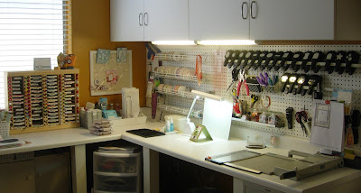 THE BACKDROP. This next photo zooms in closer to show you the unsophisticated "studio" I easily rig up for each photo. I use two white cardboards from Stampin' Up!'s Designer Paper Packs ... one lies flat on my work surface, and the other is used as a backdrop (it just leans against my pegboard.
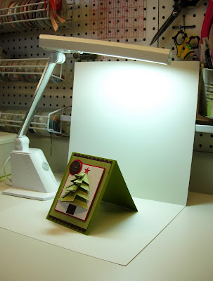 LIGHTING. I try to let as much natural light into the room as possible. The fluorescent lighting under the cabinets provides light on my artwork. My craft room has a ceiling fan & light in the center of the room. For some reason, my photos turn out better with that light off (when shooting the photo, that light would be behind & above me). I position the OTT-LITE (natural light) BEHIND my artwork, a key component. It does not shine toward the artwork, it shines directly down, behind it. I never use a flash on my camera (disaster!).
 CAMERA SETTINGS. I use a simple "Point-and-Shoot" mode and the Macro Close-Up option (tulip icon). Again, I never use a flash.
POSITIONING. I rarely photograph my artwork straight on ... I almost always angle the artwork slightly to each side. I also tend to photograph each piece with my camera slightly elevated.
PRACTICE, PRACTICE, PRACTICE. When photographing artwork I take MANY photos of it. It never fails ... I usually think a card will look great photographed from one side better than the other ... and the opposite is usually the case. So, I take many photographs from many different angles to get the best photo. Don't you just love digital for this very reason?!
EDITING. The next step is to choose the one photo from many that I think is best and edit. I use Adobe Photoshop 6.0. First I crop the photo, then play around with the lighting. I always to go ENHANCE, ADJUST LIGHTING, LEVELS. I play around with the Input Levels, and sometimes the Output Levels to get the best lighting. Sometimes, I go to ENHANCE, ADJUST LIGHTING, BRIGHTNESS/CONTRAST and adjust the lighting there too. Again, lots of trial and error.
ADD YOUR MARK. Lastly, I add a watermark as an overlay to the photo, the white lettering that says "designed by Nancy Riley". I think this is such an important step as a designer, as I've seen some artists' photos/artwork used without permission. Get a watermark to protect your beautiful artwork! I've had a couple watermarks designed by Beth Silaika, Freckled and Fun. She has lots of great designs to choose from!
As a final note, I encourage you to experiment, especially with lighting. A photograph should enhance your beautiful artwork and really show it off!
 Thank you for all your well wishes for my recovery from surgery! All went well, and am feeling more like myself every day! I was actually able to spend some time at my computer today to gather this week's iPICKS where I post a selection of my favorite cards and projects found during my blurfing (blog surfing) and SCS stalking for the week. There's no formal rules or guidelines ... just inspiring projects that catch my eye, clever ideas, and exceptional designs. These are projects that inspire me and I hope they inspire you too! Here's my iPICKS for Week Three ...


